This post will be the first in a series about the modules I wrote that everyone can use. Just hang tight and maybe you can take advantage of these too.
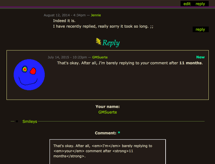
At the bottom of this page (past the comments), you can see that there is an interactive comment form that allows you to post comments without leaving the page. This ability is part of a module I wrote using JavaScript and I hope you like it.

You can add new comments, edit old ones, and make directed replies all on the same page, depending on how you set it up.
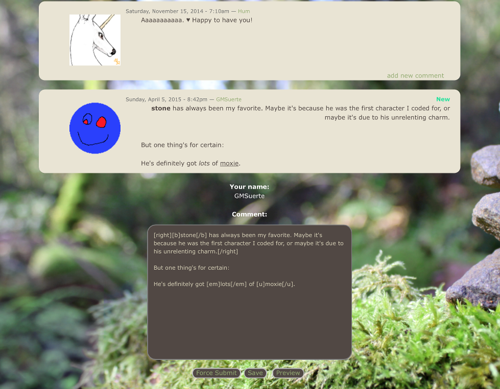
Write your comments in HTML and BBCode, and this comment form can preview your input in real time, complete with your avatar and signature.

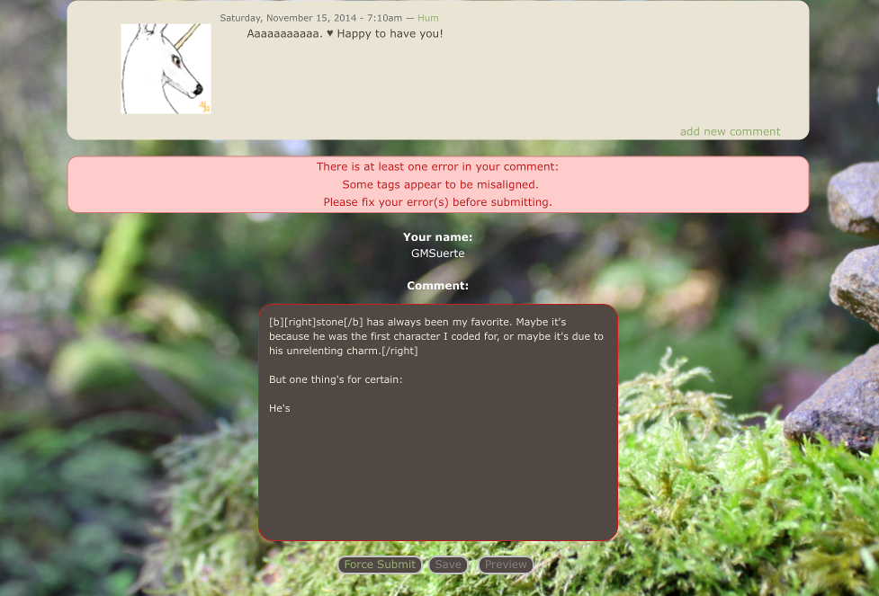
This comment form can validate your input by detecting if you have any misaligned tags, improperly nested tags, or no input at all. If it finds anything wrong, it'll tell you, and you'll be unable to submit normally. Once you fix your error(s), you can then preview/submit successfully.

If you still wish to submit your comment without letting it pass validation, you can still submit the traditional way. Just press the "Force Submit" button. Feature removed.
It also happens to have limited storage capabilities, and will remember user input until it is submitted during the lifetime of the browser's current tab. You can see this by reloading the page while you have an unpublished comment in the form's textarea.
Note: Make sure your code is under the cut, with the blog entry input format set to BBCode.
To get a comment form onto your page, you'll need to set up a JavaScript file. The default one I have made for you is this: https://dl.dropboxusercontent.com/s/6wgfzg8xhov4z75/comment-form-example-1.js. If you want to keep everything the way it is, you don't have to do anything to this file. If there are things you need to add, you can use your own link in place of this one.
In the lower half of the file, you'll see something like this:
requirejs(["jquery", "gms-comment-form"], function($, CommentForm) {
	// Internals excluded.
});
This is the entry point for your script. Of course, you can do other things with JavaScript if you know how. Note that any modules you use are placed in square brackets. You can define where the modules are in the config section in the upper half of the file. The function part assigns names to those modules.
Place this code into your blog post:
<img style="display: none;" src="/community/sites/all/modules/smileys/packs/ToT/redface.gif" onload="var script = document.createElement('script'); script.type = 'application/javascript'; script.dataset.main = 'https://dl.dropboxusercontent.com/s/6wgfzg8xhov4z75/comment-form-example-1.js'; script.src = 'http://requirejs.org/docs/release/2.1.15/minified/require.js'; document.head.appendChild(script);">

<link rel="stylesheet" href="https://dl.dropboxusercontent.com/s/ih44znn3xo222ko/comment-form-example-1.css">
The lower part is an optional CSS file. Note that you can also use your own CSS if you wish, either in a separate file like the above sample or inline with your blog post.
Once you have that, you should be all ready to go. Please note that once you submit your changes, you may need to refresh the page (such as if you are using Chrome or Safari).
The comment form module I created can be found here. This module takes advantage of other modules. These include the Validator module, which validates user input, and the Previewer module, which handles the comment previews.
This code is released under GPL v3+. Among other things, this means you can redistribute applications using this code as long as you use the same license and provide the source. Remember to leave the copyright notices where they are. Read about the license here.
Thanks to patorjk for the BBCode parser.
Do you have any questions? Do you find this useful? Did you find any mistakes? Does something not work in your browser? Leave me a comment. Suggestions are always welcome.
If you find something wrong, please leave a description of the anomaly — you don't have to fix it yourself. Also include what browser(s) and what operating system you are using, especially if you notice that the problem doesn't happen on other platforms.
!!! this is great omfg
Huh
Huh. Cool!
1
2
3
4
Soooo neat. Gj, and ty.
Thanks, y'all. And "huh" to
this is neat. thanks. I
G'job and handy new
I suggest making the 'force submit' button appear on error only, for the best useability. Excess never looks good.
A few other things:
> force posting a blank comment takes one to the tefc's original comment page;
> the preview feature is locked whenever an error pops up
[unfreezes when the error message is gone, but one has to tab out&tab in for that];
> duplicate comment forms if one keeps clicking 'reply/edit' or 'add new comment';
> if one puts a bunch of smileys in a row, only the first one is placed at the text cursor, the rest are added to the bottom of the comment.
It does indeed, the 'plugged.
Thanks for the feedback, Uit!
- I actually agree with you on making it appear on error only. However, several months ago, someone made it known to me that they couldn't even submit at all. I believe I fully fixed that bug (hopefully?), but they insisted on having a force submit button on the form at all times, so I kept it there. I may make that change, though, cuz I actually really hate looking at that button.
- That's actually intended, even though it's called "Force Submit." I wanted to give the user the option to preview their comment traditionally before submitting traditionally. I don't know what else to call it. I could call it "Go to traditional comment page," but that's way too long, possibly even if I put it on a separate line.
- I don't know why I never did anything about that. I guess it was to discourage people from leaving BBCode errors? But now that I think about it, it doesn't really make sense to do that for a preview, so I'll change that soon.
- I can't believe I missed that! I hopefully fixed that. Also, that was only happening when I clicked add new comment. I couldn't get that to happen for "reply/edit." If the problem persists, can you or anyone else tell me on what browser and OS this is happening on?
- Oops. I must've miscalculated. I'll try to fix this as soon as possible.
Again, thanks for the suggestions. They were really helpful!2. I'd leave the old box out
And it doesn't make much sense keeping when you've got a full-fledged code meant to replace it. Getting referred to the old page breaks 'the flow', to me at least.
Btw, the new box also pops on that page.
4. Firefox /Windows 7 here.
'Reply' duplicates on different comments.
'Add' fixed.
'Reply' and 'Edit' don't duplicate on the same comment anymore, but they can still be 'stacked'.
Okay, so I think I fixed the
I didn't think of it as a problem that the form popped up on the traditional comment form page since that page wasn't meant to be used anymore anyway. However, I noticed that it appeared during blog entry edits, so I got rid of both occurrences.
I don't think of that as being a problem. They're certainly not duplicates — they have different form data and point to different comments, so if they're submitted, they will count as replies to the comments they appear under. Unless you mean something else by that, but it wouldn't be apparent in the screenshot.
I didn't really think of this as a problem either, but the forms do take up a lot of space.
A while ago I considered making the edit/reply buttons show/hide the respective forms when clicked on, but only when the form has already been summoned. I've been so lazy that I just put it off, though, since I have all the essential comment form functionality worked out. I could also make it so that those buttons also hide the other (in other words, "edit" hides the reply form and "reply" hides the edit form), if both of them have been summoned. I dunno if that would be a good idea though.
Anyways, thanks again.
P.S. I didn't click "reply" to your comment in case you wanted to remove those screenshots. I don't mind that they're there, but I know I'd hate it if I couldn't remove them without breaking the links.
Good call. I was gonna expand
putting forth an idea you've already mentioned.
It's about allowing for only one box to be open at a time, whether it's a reply/add/edit.
The module gets streamlined, moreover, it ties in with the comment structure logic [which shows up as chronological, despite the buttons screaming nested].
Looks rational to have a single form per page as:
> the reply won't appear nested anyway and will add up to the end of the thread;
> in the case of several forms opened, only one of them is active when it refreshes the page on submit, the rest get void as a result.
You're welcome. Worked with the form myself on request, so this naturally got me interested.
I get what you're saying and
I just went ahead and made the change. You're right — it does seem better to just have one form at a time.
I know the animations are cheesy, but they're the best I can do. It's 100% jQuery btw, not anything I did personally. I could remove them if they're too annoying. I think later I'll put in an option for the coder to change the animation on their own if they want.
Oh, I see. Well I'm glad this is at least slightly interesting.
Not just interesting, it's
jQ animations fit right in. Usually not a fan of entire blocks animated, but this is looking smooth, I would keep it.
P.S: they don't run after the progress bar.
again
they don't run after the
I know. I made the progress bar (and the other new things) a part of the form, so changing this would take some work. I think it looks fine the way it is right now.
Nice