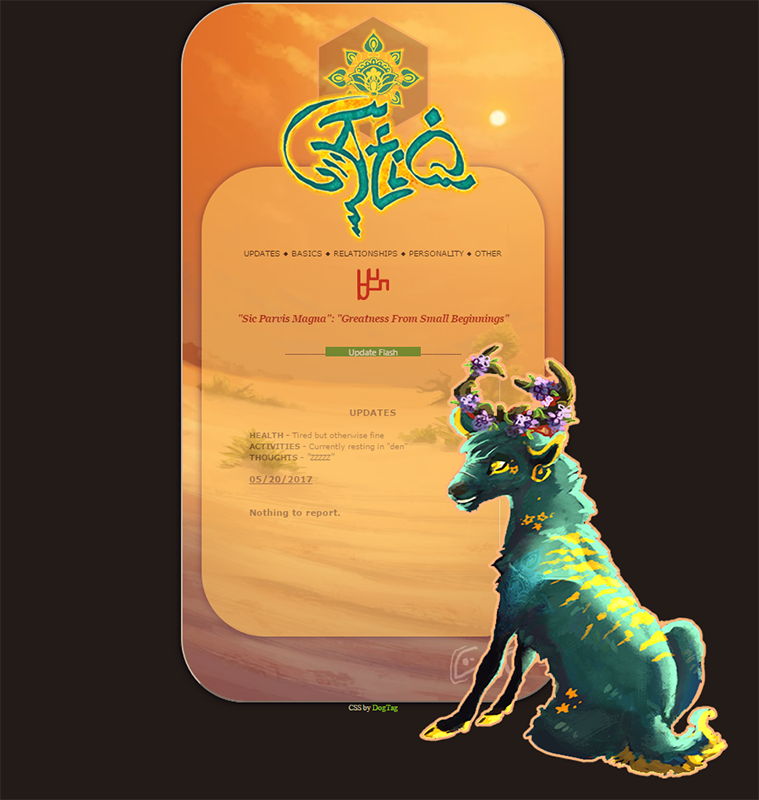
Ok so some very nice souls have been patiently helping me trying to figure out the CSS on Atiq's bio (bless your hearts) but I'm exceedingly inept at code lol

this is all I'm trying to do, put his name (which is an image) and and image of him overlapping parts of the bio, but I just....don't...know how? Like specifically the code needed and where in the world do I stick it XDD
I've looked around all day at coding websites and forums but all of it just looks like a mess to my brain.
I know I'll figure out something eventually, just anyone have anywhere to point me? Much appreciated.
(ignore the update Flash bit, that part is fixed now haha) 

<img src="IMGHERE"
?? maybe will work? Just have to change the values to position them right.
snagged from here: css quick reference.
Awesome, I figured it out,
turns out I was sticking the image codes in the wrong spot in the code haha
last thing: Now that they're in the right positions and all set, the whole thing got pushed to the bottom of the page, do I tweak one of the top/bottom/etc positions on something orrrr...?
(thanks for being patient |3)
I'm sure there is a more
<div style="width:0px;height:0px;"><img src="LINKYDINK" style="position:relative;height:#px;left:#px;top:#px;"></div>Both of you helped me narrow
I managed to get his name centered in the top but the image of Atiq just stubbornly refuses to move down to where I need him, and only entering a stupid high pixel amount made him move at all >.<
It also pushes the WHOLE thing down still...
and @Aivilo I tried to put the images inside a 0x0 div box like you suggested but it put them behind the desert background image.
It's so tantalizingly close it's insane XD
add: z-index:10; inside the
z-index:10;inside the div box's style property.