A few things I hope will be helpful.
Apr.2012-
My interest in art has always been squarely on character creation and character-based storytelling. Coming into the Endless Forest, however, I became more aware of the environment itself as a character. I have always been shy about attempting to draw inorganic objects in space, or simply disinterested, so I've avoided drawing 'backgrounds' until recently. I've come across an inspiring sketchbook, and decided to encourage my fellow artists to think more about environment, and begin placing your characters into a world more frequently.
I hope that the following images (from Disney's Sketchbook Series: Bambi) will show you that a place also has character, and representing that is sometimes not so overwhelming or complex as it may seem. Simple backgrounds can showcase a character, or create a sense of a larger world around that character. The term "background" calls to mind a painted backdrop on a theater's stage, or placed behind a person having their picture taken. So let us do away with those connotations for now, and think of the world around your character instead as their home, their environment. A place for them to be (rather than always floating in empty space). Of course, character-only artwork is perfectly acceptable and appropriate in many contexts. But I hope that others like myself who
fear depicting the surrounding world may find this an encouraging push to take on the challenge. Notice while you look through how light and color are used to create atmosphere and an emotional quality to the work, and how few details are actually included in the drawing/painting.
Clicking the image will take you to a photobucket album where I've uploaded select images from the sketchbook.

I am currently at a level where just playing with simple depictions is still a challenge. But once you feel more comfortable with drawing backgrounds and a greater sense of enjoyment from drawing your characters in a world, I encourage you to study atmospheric perspective, linear perspective, and begin drawing from life. No matter where you are, you are in a space, and you can learn from trying to draw it.
Arial (atmospheric) perspective
Introduction to linear perspective with exercises
Good luck, and have fun.
==============
In response to
Sidewalk's thread I decided to try and draw up a couple notes about drawing antlers. Not comprehensive. My first suggestion is as the others in the thread posted- look at and draw from reference from many angles.
Quote:
...it helps me to line up the tines (so the left tines are at the same height and of the same length as the right tines). If the antlers are at an angle, you can still draw a straight line between the top of the left and right tines. As with everything in nature, perfect symmetry is unlikely. But near-perfect symmetry is common and one of the first things humans pick out when looking at something*
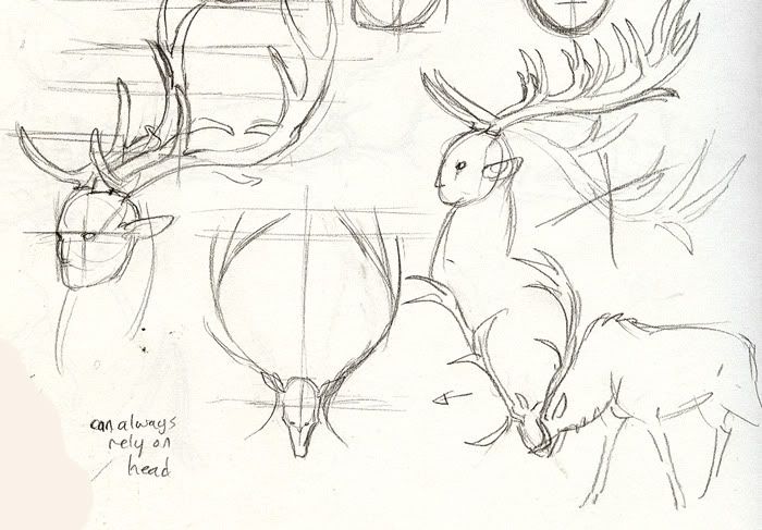
Additionally, avoid drawing the antlers flowing back towards the animal's back. When a stag has his head lowered, his antlers are dangerous weapons in front of his head, not behind it (I always mess this up).
If in doubt about the symmetry of antlers, you can rely on the head:

*Good note on symmetry-
p.59 "Making Comics" by Scott McCloud
While I was thinking about symmetry I thought I might elaborate a little bit on
Chickenwhite's face tutorial and mention what that cross is. The vertical line splits the face into symmetrical halves. The horizontal one cuts the head in half, the line where most people's eyes sit.
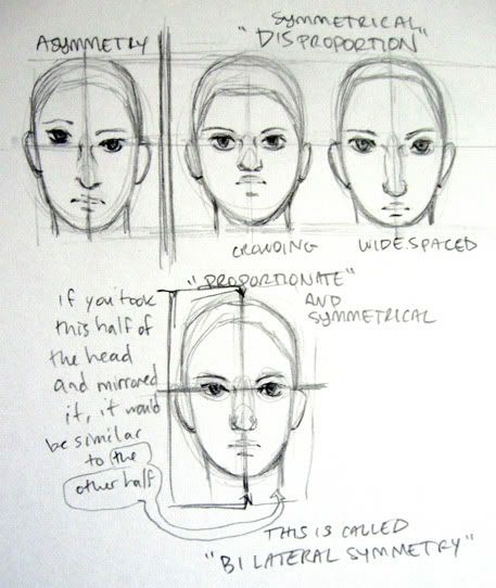
Together the lines serve as a way for you to see if everything on one side is the same distance as everything on the other side.
Disproportion may not look 'ideal' (the idea of a perfectly proportionate face is pretty subjective). But the difference in where things are and how big they are, how far or close together are how we recognize each other. Disproportion is the source of character- it makes us distinct from the 'ideal face' template. We can accept this in drawings, though if unintentional, we might not understand why it looks 'somewhat off'.
However, as mentioned above,
symmetry is something that even non-artists are hyper critical of. It's hard-wired into us to notice asymmetry (it bothered me a lot to draw that purposefully... does it bother you to look at it?). Even if a face is disproportionate, it still looks natural, possible, even beautiful, so long as the parts are symmetrical.
(by the way i'm sorry all the drawings I did are slightly asymmetrical by accident. I have a hard time with it. One trick to help fight this is to flip your work from time to time, or look at it through the page. Another is to make sure that you are drawing with the paper angled, not flat horizontal on the table or flat vertical on a wall)
So
that's why you draw those lines, to check the symmetry between sides. They're also a way to help keep track of 3D space. If you'd like I can try to make an explanation of that, but
this is more thorough than I can offer.
Thanks to Chickenwhite for the face tutorial. Please ask any questions you have or let me know if you want some clarification with something. I might not know but i'll try to find out for you.
At Kaoori's request I tried making a tutorial of how I paint, but this walkthrough is the best I can offer for now. Pardon the length and lack of linear process explaination, please ask any questions you may have.
start to finish photoshop cs3 default hard round brush. Final layer count: 2
Additional, far more useful resources!
Comprehensive drawing and painting tutorial (good place to start)
Brilliant light and fur tutorial (part 1)
The figure in 3D space, beginning 4-point perspective
If you can understand and implement the ideas in these tutorials, you will have surpassed my own meager skills.
And please, remember that art should be something that adds to you, not something that takes away. Enjoy.


-tracking- Thank you so much
Thank you so much for this!
- twaclin. I'll be sure to
Tracking as well. I can
Walkthrough video and
I don't strive to be the best, but instead I strive to do my best, and always give it my all every time.
-faunet
tracking this to read later
Everything here is incredibly
nice
Thank you for posting this,
RaQu! You live!
I don't strive to be the best, but instead I strive to do my best, and always give it my all every time.
-faunet
Now and then
Thank you!
(No subject)
Thank you so much for posting this. I need to read this through better later.
Thank you so much for posting
gonna track this so I have
That was a very amazing video
Keeping my eye on this as
This is so GREAT!!! Very
Very useful!
I feel stupid asking here, but how's the collaboration with ickydog?
Dragon Scroll.
Avvie by me, siggy by Saosin
I'm not sure I remember a
If you could remind me I would appreciate it.
I don't strive to be the best, but instead I strive to do my best, and always give it my all every time.
-faunet
Nifty~ I'll have to look this
I'll have to look this over more thoroughly when it isn't 2:30 in the morning.
Added link to a sketchbook
I don't strive to be the best, but instead I strive to do my best, and always give it my all every time.
-faunet
It won't let me see the album
*really wants to see*
.
Thanks for telling me, Gut.
I don't strive to be the best, but instead I strive to do my best, and always give it my all every time.
-faunet
Yep! Works now! I'll check
Eyestrain, it is so nice to
w o w I would love to see
I would love to see Bambi all over again all in your style.
Just to clarify, the images
Glad you can enjoy
I don't strive to be the best, but instead I strive to do my best, and always give it my all every time.
-faunet
Tracking!
TRACKING lovely tutorial by
Layers are like using
trackitydack! Faces are hard
Thank you, Tuo and Kohva!