Disclaimer: Both this guide and the map itself are currently a work in progress.
This is an example implementation of the player collection module.
I noticed that the authors of the map don't really have time to update things (the map included) on this site because they have more important things to do. I know this doesn't seem like much, but I put together a new version of the map.
This version does not use Flash, so some of you may find that you can view it on some mobile devices and the like. However, I have not yet implemented many of the interactive features on this map for mobile devices. I plan to do whatever I can about this eventually.
The time showed is your time, not the time of the server.
If you are on the www. domain and you are logged into TEFc (this forum, not necessarily the game), the links to the player pages will hopefully be accurate. If you find an instance in which it is not, please tell me. However, please note that the links you may see are generated dynamically and thus their results are cached for thirty days in order to reduce the number of requests.
If there is no account page for that player, you will be redirected to the search page to find if that player's user name has been mentioned.
If you are not on that domain or you are logged off, you will get the same page that the original map would give you.
Contrary to popular belief, I do not believe those blank spots you come across while tabbing on the original map are unnamed deer. I have briefly verified this for myself both by inspecting the original map and by playing the game.
The pictogram will increase in size like normal, but then show its name.
The pictograms will move to their new positions on the map when the server has updated their status.
Notice that all the pictograms will not disappear and reappear each time the server updates, like they do in the original.
Also notice that the pictograms that are no longer on the map disappear gracefully.
Hover your cursor around on the map and you will see the coordinates of where you are pointing.
Drag the status text or coordinates around the map to move them out of the way.
There are some compromises you may need to make if you wish to use this version of the map over the original:
This applies to someone who wishes to use the map on their own page. You obviously may wish to ask someone to code it for you if you don't know how.
Note: Make sure your code is under the cut, with the blog entry input format set to BBCode.
Place this code into your blog post:
<img style="display: none;" src="/community/sites/all/modules/smileys/packs/ToT/redface.gif" onload="var script = document.createElement('script'); script.type = 'application/javascript'; script.dataset.main = 'https://dl.dropboxusercontent.com/s/u77imj0qjsjo6ce/map-example-1.js'; script.src = 'http://requirejs.org/docs/release/2.1.15/minified/require.js'; document.head.appendChild(script);">

<link rel="stylesheet" href="https://dl.dropboxusercontent.com/s/m0ch6zimxy97bwi/map-example-1.css">
The lower part is a mostly optional CSS file, but I think it would be good to start out with that CSS and then add your own changes after that file.
Now, place this where you want the map:
<div id="map-example-1" class="gms-map"></div>
Please note that I am not including simplistic cross-browser issues with CSS in these examples. It may be a good idea to include the appropriate prefixes, if necessary. I.e., insert -webkit-filter and related declarations before filter.
Do you think the background is too dark? You can revert it to its original state:
.gms-map-floor {
	filter: initial;
}
Or let's say have a biography, and you have a theme in which everything is gray or something like that. You also wish to use the map on your biography, but it's too colorful. No problem, just change the CSS:
.gms-map-floor {
	filter: grayscale(1);
}
Note that this doesn't change the colors of the landmarks. If you wish to do something with those, you can use the selector .gms-map-landmark. .gms-map will apply effects to the whole map.
You can also change the background image itself if you desire:
.gms-map-floor {
	background-image: url("path/to/image.png");
}
Now, this isn't a CSS reference or tutorial. If you need help for other possibilities, ask someone you know who can code.
Now we're talking. Stay away if you don't know JavaScript.
// Generally before you call players.startUpdating();
mapView.statusView.dateFormat = "MMMM Do [at] h:ma";
mapView.statusView.template = _.template("<%= numPlayers %> deers online on <%= dateString %>");
Sample result: 26 deers online on November 24th at 8:54pm.
You may not consider some of these to be issues, but they are present.
This isn't a huge deal, though.
Currently, the map works somewhat when changed to a different size, but only if it retains its square dimensions and some features may not work properly.
I will do my best to make sure all features work in all sizes and all ratios.
Also, currently the map cannot be resized; its size must be determined before you put it into the page.
If the same pictogram shows up on the original map twice or more, it will only appear on this map once.
I know this is rare, but it's still technically an issue.
I will have to double check to make sure.
I could try to make draggable entities not leave the bounds of the map.
This is a browser storage issue and can be pinpointed to one of my other modules. I will fix it as soon as I can.
I know why this is happening, but I haven't decided exactly how I am going to fix this yet.
There are some things I plan to implement eventually, if I ever have the time. I may prioritize bug fixing or new features based on user demand, but I cannot guarantee anything. I also encourage you to come up with anything you think the community may find useful.
Allow the visitor to change settings related to the map. Changes will only affect what they see and may include:
Maybe once a day.
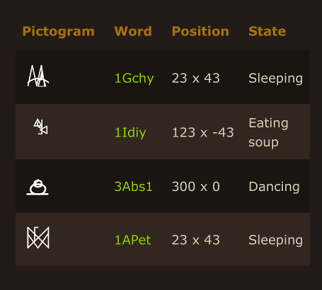
A pictogram table that shows all user information laid out so you don't have to hover each pictogram individually. This may be a bit redundant, though, considering the map's current features.
This could also be its own, standalone thing.
Here is a mockup:

Please note that eating soup is not a real action (at least, to my knowledge).
Hovering/tabbing on a row on this table could automatically focus the corresponding player on the map.
Could include a pictogram/user search function to see if they are online using either their account name or their pictogram name.
Could maybe make this customizable.
Let's say you have a character who is always at the pond, or all you care about is the pond. I thought it would be useful to create a version of the map that only shows a small area around the pond. Then, maybe you could put it on your biography (if it fits the theme, of course) and not feel bad about that because it doesn't take up a lot of space.
Maybe you really only care about you and your friends, and you don't care about them other people. I would like to implement an option that only shows those people. A lot less clutter, right?
Here is the source for visual representation of the map.
The source code is released under GPL v3+. Among other things, this means you can redistribute applications using this code as long as you use the same license and provide the source. Remember to leave the copyright notices where they are. Read about the license here.
Original map © Tale of Tales. Assets including the map background, pictograms, and landmarks also © Tale of Tales.
Please do not credit me personally for directly implementing anything animation- or interaction-related. Those things were all done using jQuery.
Bump Need to keep this on
Need to keep this on the first page.
Hello ok this is awesome will
This is the on-site map of
It is just the map of the Forest to show where is currently everyone, including you if you are in-game.
.
Bump.
All i was thinking was since
What newer version of TEF you
Here you go.
http://endlessforest.org/community/update-4
http://endlessforest.org/community/no-development-grant-phase-four
These are other posts. So why
So why are you asking the author of this post about the coat? It is M&A you should ask.
Becouse i thought the OP was
That explains all. But they
I just did not want to leave you in your small mistake. Why? Is that forbidden?
I guess I could do that and do the same for the next people I will meet who will make small non-important mistakes but then feel embarrassed or idiot once they realize them. I just did not want that to happen in any way. Sorry if I wanted to give a bit of help here. I guess I should have shut my mouth up (sorry if this seems rude).
Oh ok and hey sorry as well i
I can understand, do not
I understand as well no
:>
Magnificent art by 7FinalGirl8 (Hagal)
Hey, GMSuerte. I've been
I know I would never get involved in this project, and keep it running and get ideas of improving it, if it weren't for your original brilliant execution of the concept, and the concept itself.
So, I want you to get due credit if they use my code on the site. I want to be fair. Tell me what you think.