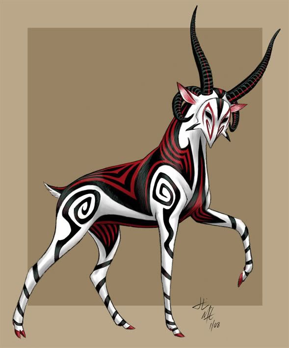
I started out with the idea that I wanted to do a kabuki-style mask. However, with most of my ideas, they begin in one direction then end up thirty galaxies away. The red markings went through
many different design changes, including color changes from red to yellow to dark green/blue. Keeping with the kabuki theme, I went back to the red.
(
Larger Version)


Favorite.
Niiiiiiiiice!!
Impressive!
Beautiful
♥ ♥
♥
Those spirals totally do it
Wicked! And kinda scary.
Ooo very nice! Those spirals
I like the method you used to make the fur look shiny; it's very well done
Deliciously evil. >:)
Love this! Those horns are
(Ok this blog thingy rocks!
I love how neat and balanced the colors are on this design, they're flashy withought being too crazy. The swirls are so pretty, I love the antlers too how they are straight and curved. The thin red line going through them breaks up the black on the antlers nicely. The mask looks amazing I love its pointyness. The red is so wonderful covering this deers' back, it fits really well together. Good job on all the effort you put into it.
I've said it before and I'll
| Deer | Art | More TwoEars |
Very intriguing designs.
Fire is my Brother
Sword is my Friend
Blood is my Lover
Death is my Destiny
Sword is my Friend
Blood is my Lover
Death is my Destiny
OMG! I just started 2 days
I took my idea from a Jacob
yes I posted it
o wow i like the colore
DO WANT
Just amazing!