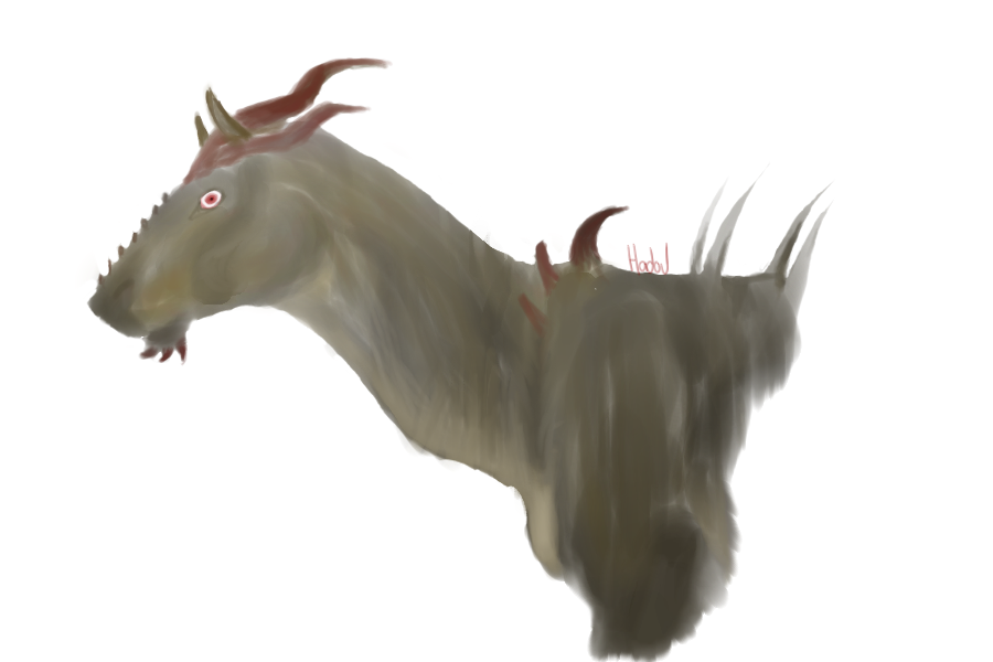
and lineless

trying to get used to this digital painting thing, so i doodled a naxkiin. just played around with some things to see what would happen. wasn't meant to be a lineless, but it looked pretty cool without them so im like hey, why not.
he's my favorite character to draw really he's so cool i can't even
thank you rhhya for giving his design to meee
so the usual, i want critique, and constructive criticism.
even just criticism.
does it look good, or bad,
what tell me in all honesty,
i need to know these things to get better.
he will be back in the forest soon, working on finishing his ref, and bio, perhaps by next week, yay.
also background is for the purpose of their being a background, another reason why i do not do backgrounds.
anyway, thank you for read, you're great, i hope you had a fantastic day.


You did a very good job with
I would like to say is to add darker shading that will give him that three-dimensionality. Don't be afraid to put a very dark color. Try even putting the darkest color first.
Also, I would recommend some shading on his eye, like a grey tone or whatever tone you'd like for him.
nika, you are too awesome
<3 bumping this once, just once.