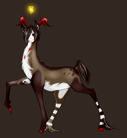
So, yesterday I registered on here and searched the forum for the wide selection of pelts, masks, and antlers and I've decided out of those that are given what Swartii will look like. Hopefully you guys like him, but even if you don't 'd love some feed back.
Also, does anyone create deers that aren't pelted,masked, or antlered (lol) like that ones the game gives? Cause I'd love to make custom deer.

IN-game, you can only have
Out of Game, you can create a deer to be whatever you want him/her to be. Some people on here have deer that they say "Shape Shift" and then they have a different set for each of the "forms" of their deer, some have deer that are monsters... etcetera.
Your character is not limited to being a deer with a certain set in the forest, nor is it limited to being a deer, but in-forest, it is the character as a deer with a set.
(thanks, starling! The avatar is amazing! And Thanks Pretzil for the siggie!
Ah okay, that makes sense.
hehe I am glad you
You are very welcome
(thanks, starling! The avatar is amazing! And Thanks Pretzil for the siggie!
I like the markings a lot !
Avatar & signature by Shimmyshimmy. ♥
It's looking good, and I love
Thanks you guys!
@WatchBreaker: Thanks for the tip! I'll be sure to work more on thinning out the legs. I thought they looked pretty thick myself, but I was just trying to jot down his design more than anything. Thanks again for the tip.
The legs seem fine to me.
Real deer aren't as Beautiful and delicate as people think they are
No, they are not all delicate
Very cool design indeed. I
If you cover it with your hand, there's nothing shocking at all (apart from the right back leg), yet if you cover your deer's back, it brings out how tiny you made the face ( I mean really tiny), and narrow the neck toward the end. So everything seems larger!
As for the right back leg, once again, if you cover the whole upper body and abdomen, it looks like it overlaps the left front leg. You choose to do a light shading at the end of the back leg, while the rest of it is darker, and you did it so that the whole portion is highlighted instead of just the borders, though it would have followed more the logic of how you worked with light and shadows in your drawing.
Thus, big contrast with the front leg, resulting in this overlapping impression!
Yeap! What do you think?
Overall, I'm really fond of your design, the traits are refined and the colors oh-so-yummy!