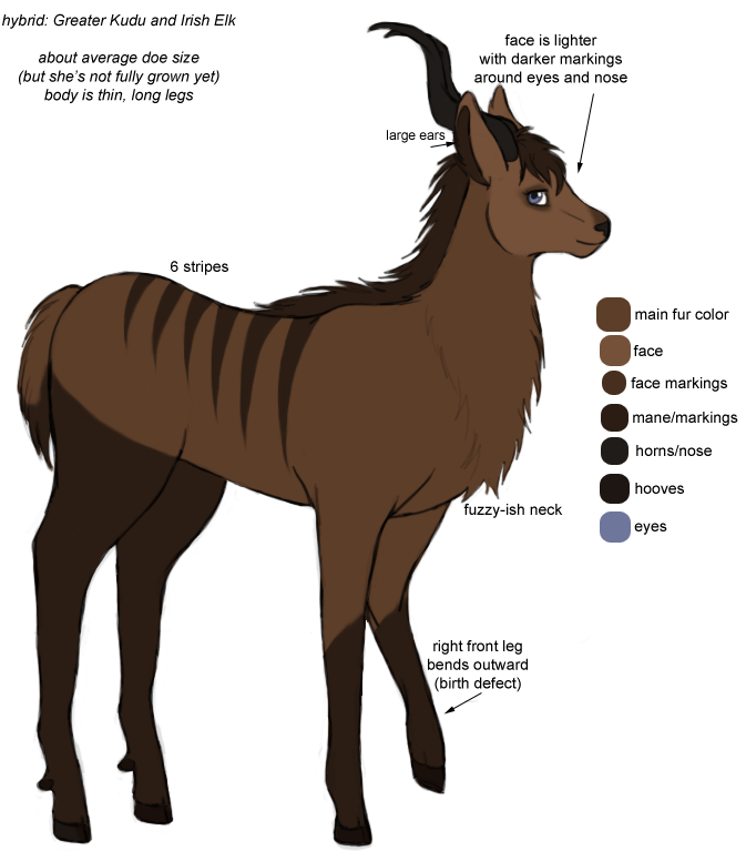
Finally, Phoenix's new design is done. Now that I know what her new set will be (really just her antlers will change) I can finally play her in-forest again.
I used a reference this time. But I made her thinner on purpose, because she's supposed to be young and not fully grown yet. It still looks weird, but I only had pictures of adults, so I wasn't sure exactly how to make her look younger.
Her design actually didn't turn out all that different from before. I tried making her blue, like her father, but in the end I decided the brown version looked better. I guess it suits her better.
I still don't know how to draw the bowed leg. But, as long as it gets the point across.
Let me know if anything isn't clear, or if you think I should add something.

She's got a pretty face. c:
Such a pretty babeh
(:
I love her eyes~
8U She really looks like a
Awesome :3 I love kudu ~
I love kudu ~<3