Hap that occurs defying your understanding of the probabilities
-wow, puntastic!- (If you don't get it, pronounce the title.)
Anyways.
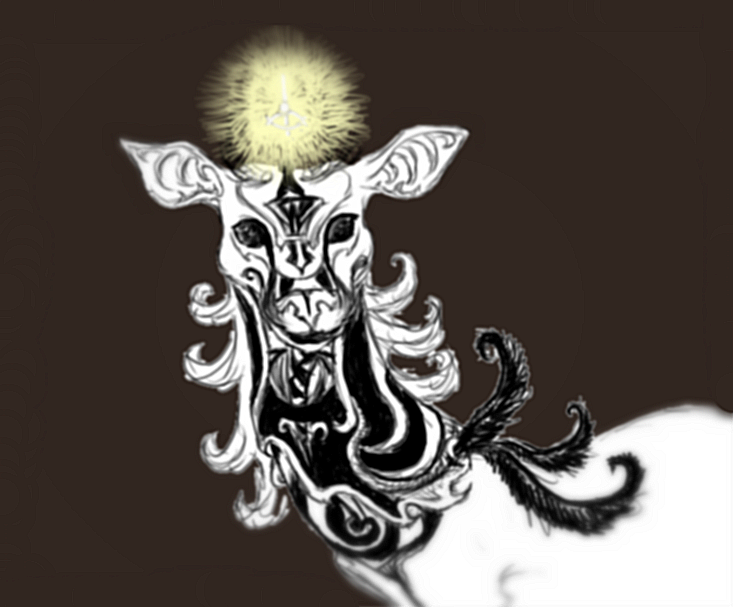
Here's a random design that appeared on my canvas 10 minutes ago, while gathering will to start working on my dozens of unfinished gifts (again).
It's messy and confusing and looks more like a cow than a deer. Haha, I love it. However...
I know there's no chance I'm going to use it so
I'm putting it here for adoption.
~Information undercut~
Oh by the way...
FEEDBACK
You don't have to use the entire thing exactly as it is, you can just take a few markings here and there (because yes, this is a messy and incomplete concept and I'm not very happy with those feathers) but keep in mind that such might corrupt the pattern. Also, please notify me what you're going to take away. You don't have to keep the silly name either.
Colors only for visualizing all those confusing markings better. I believe the whole thing would look better in warm tones, maybe some violent reds and golden highlights. I'd prefer if you used a single color in most of the areas in white, because the patterns do have a logic, for example the symbol on the brow is meant to depict a skull, the triangle in the middle is the nose hole, under it are the teeth and the feathers on top are its eyes, not very visible because of the background. Every marking is incorporated in a larger symbol.
If anyone is interested in my random creations I might add more later.


Wow... amazing !
Thank-you c:
Hmmh, I really like the
As for feed-back... Hm, the only things that I noticed might be that his nose/muzzle is a bit wide and shaped more like a dog´s than a deer in my eyes, though it kind of fits in with the stylished style. Also, the face kind of gets a bit mixed up with all the complicated markings so it might be harder to make out with a glance.... but that might have been your idea with it?
Love the idea of the larger design the smaller markings form anyway. =)
I like the complicated
I don't strive to be the best, but instead I strive to do my best, and always give it my all every time.
-faunet
I'm conflicted over the
Other than that, I think I would like to see the piece in color. The ones you mention in your explanation sound very fitting; gold and red are very loaded colors and could help you express your symbolism and the overall mood of your character.
You mention you aren't sure about the feathers, and I think you're onto something. The idea is nice, but maybe more of them would help them look less out of place? Experiment and see what works best.
I hope that critique was helpful, I'm interested to see if you continue to work with this character design!
Oh, so it was as simple as
Thank-you everyone, your suggestions were spot-on, I'll try giving more individual replies
tomorrowSpyrre
Thanks for warning me about the face, I've been looking for issues like that since I finished it, but I'm not having much success since I can't "see" the individual strokes anymore :) the markings bellow the chin are meant to look a bit 3d but hiding the limits wasn't intentional.
eyestrain
Thank-you, I will do that.
Terabetha
That effect alone disappeared when I removed the white background and added the pictogram, and the blur that I added in Photobucket didn't help much either. This is sort of what it should look like. And still I'm guessing I'm only seeing what I expect to see - I do have to improve that; I can't expect people to know what to look at.
Ah, I was so annoyed at the feathers that I didn't even think the reverse solution, adding instead of removing :o It's a good idea, thanks again!