I decided to play with
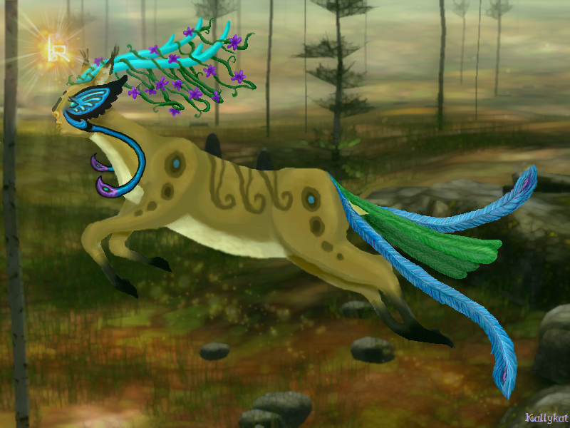
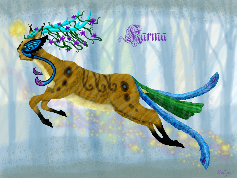
Karma's bio pic a bit and create my own background. This is what I came up with. I think I might prefer it to the old pic.
I'd like to know what you guys think. The old pic is below the cut.
**Vote so far:
Picture One (new)- 2
Picture Two (old)- 2

(Karma's story:
Part One,
Part Two)


I'd say second one. ^^ By the
By the way, they're both quite lovely. :3
Picture 2
Ooh, very beautiful! I
I personally like the first picture because the deer stands out better from blue backround, and I love how you did the very light forest behind it. And the perspective of it works better with the perspective of the deer. <3
I like the top one, the blue
Thank you for your opinions,
I appreciate your comments too. <3
Karma does seem to stand out more in the new pic...