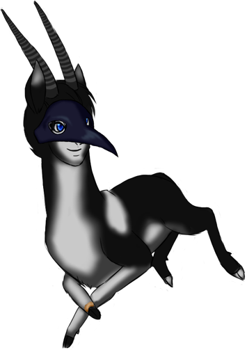
This is a very ugly bio, at least until I learn CSS.
Nigel
He is not a monster, not a hero.
No powers, no weakness.
Nigel

Thank you Licorice for this awesome picture!
Set
*
Orca pelt
*
Crow/Hands mask
*
Antelope Antlers
*
Miniature
Info
*
His parents' names were unknown. He somewhat remembers his mother's name, but only very little of it. His mother never spoke of his father, nor his name. And one day... she disappeared, and he hid near the safety of the Twin Gods, so they would protect him, until he grew up. He now searches for his father.
*
Nigel is not an enemy. He does not have any other form. He does not have any powers. He is just a normal deer, and forever will be.
*
Nigel is quite a coward. Especially bigger deer, as they are stronger. Yet he is not shy, and eager to make new friends everyday. He will run from danger, and will only fight to protect loved ones. He would die for them.
*
Nigel is a fast deer. Because of this he isn't that strong and also has low endurance, he could not run far without getting tired.
*
And that is why he is not much of a runner. In fact he hardly moves up at all. He is a lazybutt and loves to relax and snooze. Unless he is chilling with his friends, of course.
*
Very friendly and would never insult someone. He would only insult a deer he dislikes.
*
British accent.
*
Has black hair. From the back of his head, and some strands dangle in front of his light blue eyes. Hair is covered by his mask.
*
Has an ugly scar right above his front right hoof. He has no idea where he got it from.
*
He is not exactly friendly to fawns, and never really hated them either. He just... ignores them. Usually bows a greeting to the fawn, then walks away. 
Interesting~ ♥ Edit;
Edit; And you don't -need- CSS, y'know. x3 I find it a pain sometimes, and you can make a bio look awesome without using any CSS as well. Try playing around with font colors with, '< font color= "color" > TEXT < /font >', without the unnecessary spaces. You could also try justification, by making your text '< center >', < right >', or '< left >' aligned.
Try just playing with stuff, make a testing blog and use some simple images and words. You'll be suprised how easy and nice-looking it can be. ♥
I feel like tracking this
yup
Your doing allot better than